- How to Optimize Your Charity Donation Form for Success
- Why Your Charity Donation Form Optimization Matters
- The Psychology Behind an Effective Charity Donation Form
- Essential Elements of a High-Converting Charity Donation Form
- Advanced Optimization Strategies for Your Charity Donation Form
- Common Pitfalls to Avoid in Your Charity Donation Form
- The Reshine Approach: A Case Study
- Conclusion: Your Form is a Relationship Builder
- Your Next Step: Audit and Elevate Your Form
- FAQs
- What is the most important feature of a charity donation form?
- How many fields should an ideal charity donation form have?
- Should we offer a recurring donation option on our main form?
- How can we reduce donation form abandonment?
- Is it better to host our own donation form or use a third-party platform?
How to Optimize Your Charity Donation Form for Success
In the world of nonprofit fundraising, your charity donation form is more than just a technical requirement—it’s the final handshake, the moment of commitment, the bridge between a visitor’s intention and your organization’s impact. A poorly designed form can turn away even the most passionate supporter, while an optimized charity donation form can significantly increase conversions, build lasting donor relationships, and fuel your mission more effectively.
At Reshine Org, we’ve learned through experience and data that every detail of our charity donation form matters. It’s not merely a transactional tool; it’s an extension of our brand, our values, and our promise of transparency to the compassionate individuals who choose to support our fight against hunger and food waste.
This comprehensive guide is designed for nonprofit professionals, communications managers, and dedicated volunteers who understand that fundraising success depends on removing friction and building trust at the point of giving. We’ll walk through the essential elements, psychological principles, and technical best practices to transform your charity donation form into a powerful engine for sustainable growth.
Why Your Charity Donation Form Optimization Matters
Before we dive into the “how,” let’s clarify the “why.” An optimized form directly impacts your organization’s bottom line and donor relationships:
- Increased Conversion Rates: Reducing friction and anxiety leads directly to more completed donations.
- Higher Average Gift Amounts: Strategic design can encourage donors to give more.
- Enhanced Donor Trust: A professional, secure form reinforces your credibility and reliability.
- Improved Data Quality: Better form design yields cleaner donor information for future engagement.
- Stronger First Impressions: This form is often a donor’s first direct interaction with your operational efficiency.
The Psychology Behind an Effective Charity Donation Form
Understanding donor psychology is key to optimization. People want to give, but they are often held back by:
- Uncertainty: “Is this secure?” “Will my donation be used well?”
- Friction: “This is taking too long.” “Why do they need that information?”
- Ambiguity: “What difference will my specific donation make?”
Your charity donation form must actively alleviate these concerns. Every element should be designed to build confidence, reduce effort, and create a feeling of immediate, tangible impact.
Essential Elements of a High-Converting Charity Donation Form
An optimized charity donation form is a blend of clarity, trust, and ease. Here are the non-negotiable components.
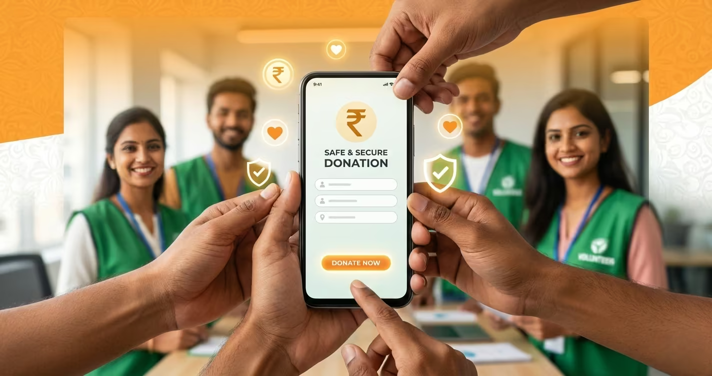
1. Trust & Security Signals: The Foundation
This is the most critical section. If donors don’t trust the form, they will not complete it.
- SSL/TLS Encryption (HTTPS): This is mandatory. Your form must be served over a secure connection, indicated by the padlock icon in the browser. Never collect donations over HTTP.
- Security Badges & Logos: Display recognized trust seals (like your payment processor’s PCI-DSS compliance badge) prominently near the payment fields.
- Privacy Assurance: Include a short, clear statement like, “Your payment information is secure and encrypted. We will not share your personal details.” Link this to your full privacy policy.
- Organization Identity: Feature your logo, and use brand colors and fonts consistently. The form should feel like a natural, integrated part of your website (reshineorg.com), not a third-party afterthought.
2. Clarity & Simplicity: Reducing Friction
The path to completion must be as smooth as possible.
- Minimal, Logical Fields: Only ask for what is absolutely necessary to process the donation and issue a receipt. Standard fields: Amount, Name, Email, Payment Details. Avoid unnecessary fields like “Title” or “Company” for individual donors.
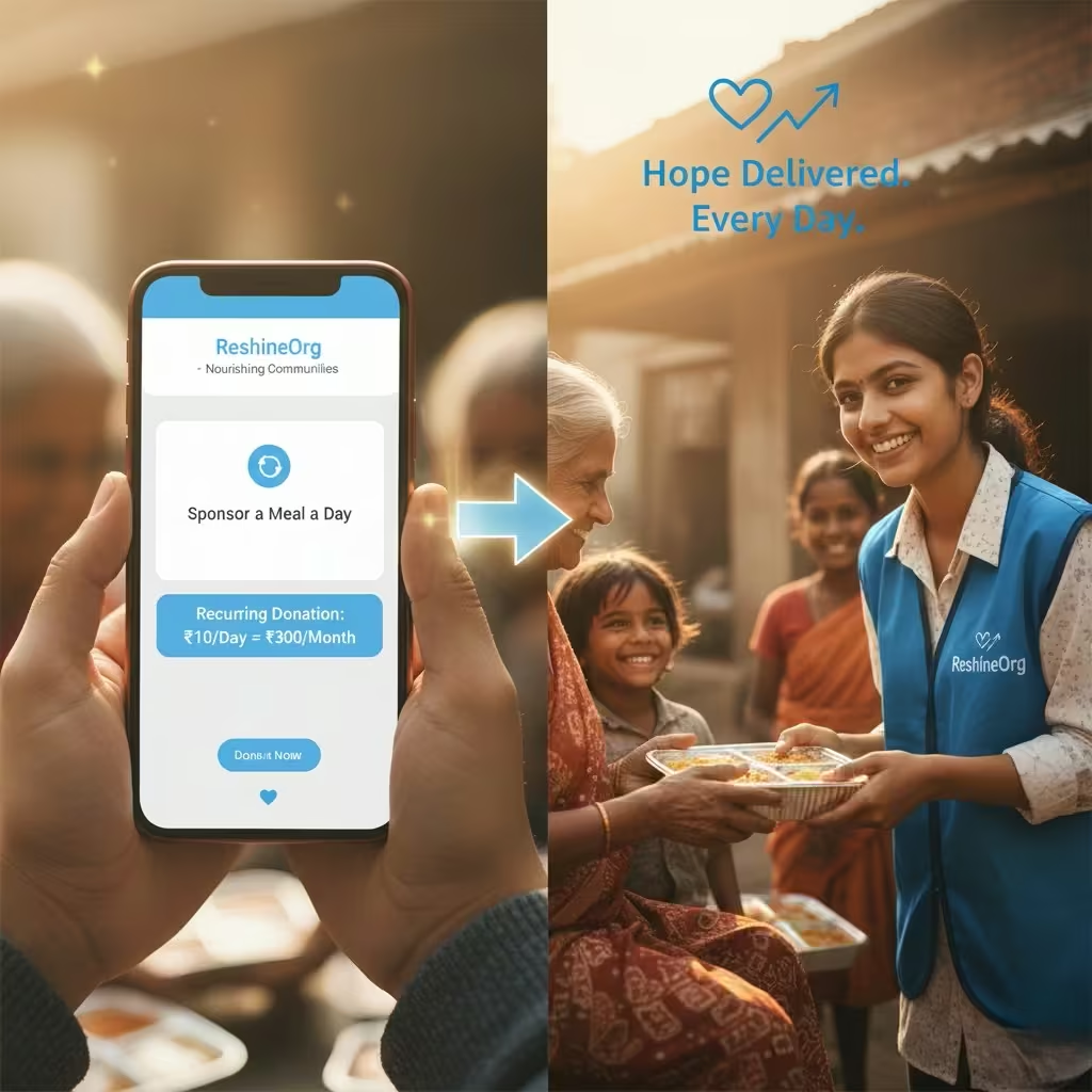
- Smart Defaults & Suggested Amounts: Pre-select a recurring monthly gift option. Use psychology-informed suggested amounts (e.g., ₹500, ₹1,000, ₹2,500, Other) with labels that connect to impact: “₹1,000 provides 40 meals.”
- Progress Indicator: For multi-step forms, a simple progress bar (e.g., “Step 1 of 2”) reduces abandonment by setting clear expectations.
- Mobile-First Design: Over 50% of donations happen on mobile. Your form must be fully responsive, with large touch-friendly buttons and fields that are easy to tap and type into.
3. Impact Communication: The “Why” on the Page
Donors need to feel connected to the outcome as they fill out the form.
- Impact Statement: Place a concise, powerful reminder at the top or side of the form. Example: “Your donation today will rescue surplus food and deliver nutritious meals to families in need.”
- Dynamic Impact Messaging: If possible, use a simple script to update the impact statement based on the selected amount. “You are providing approximately X meals.”
- Reassurance on Fees: Be transparent. Use wording like, “100% of your donation goes directly to our food rescue programs” or “A small 2% processing fee will be added to cover transaction costs.” Hiding fees leads to cart abandonment.
4. The Payment & Submission Experience
This is the moment of truth.
- Multiple Payment Options: Cater to Indian donors: Credit/Debit Cards, UPI, Net Banking. Display recognizable gateway logos (Razorpay, PayU, etc.).
- Seamless Integration: The payment process should feel embedded. Avoid clunky redirects to generic, unbranded payment pages if possible.
- Clear Error Handling: If a card is declined or a field is incorrect, the error message must be specific, polite, and highlight the exact field that needs attention.
- Unambiguous CTA Button: The submit button should use action-oriented, positive language. “Secure My Donation,” “Provide Meals Now,” or “Complete My Gift” is better than just “Submit.”
Advanced Optimization Strategies for Your Charity Donation Form
Once the basics are in place, these strategies can further boost performance.
- A/B Testing: Scientifically test different elements. Try varying the CTA button color, the suggested donation amounts, the placement of the impact statement, or the header image. Tools like Google Optimize can help.
- Exit-Intent Pop-ups: If a user shows signs of leaving the donation page without completing, a gentle, non-intrusive pop-up can offer help, reiterate impact, or address a common FAQ.
- Social Proof: Include a subtle, rotating testimonial or a counter showing recent donors (e.g., “127 people donated this week”). This leverages the powerful principle of social validation.
- Post-Donation Experience: The journey doesn’t end at submission. Immediately display a heartfelt, specific thank-you message with next steps: “Thank you, [Name]! Your 80G receipt will be emailed to you within 2 minutes. Would you like to share that you just provided 40 meals?”
Common Pitfalls to Avoid in Your Charity Donation Form
- Forced Account Creation: Never require donors to create an account or password to make a one-time gift. This is a major conversion killer.
- Too Many Steps: Condense the process. A single-page form consistently outperforms multi-page forms.
- Vague or Missing Error Messages: “An error occurred” is frustrating. Instead, use “The card’s expiry date appears invalid. Please check and try again.”
- Lack of Mobile Optimization: A form that is difficult to use on a smartphone is costing you donations.
The Reshine Approach: A Case Study
At Reshine, our donation form is built on these principles. We use a secure, embedded one-page form. We prominently display our 80G certification and security badges. We offer clear, impact-linked giving options (₹500 = 20 meals, ₹1000 = 40 meals). The form is fully mobile-optimized and features a reassuring message about fee transparency. After submission, donors receive an immediate, automated thank-you email with their receipt and a link to our latest impact report. This closed-loop experience is designed to build trust from the first click to the final receipt.
Conclusion: Your Form is a Relationship Builder
Optimizing your charity donation form is an ongoing process of refinement and respect for your donors. It’s about recognizing that the act of giving is emotional and rational, and your form must speak to both. By prioritizing security, simplicity, and a strong connection to impact, you do more than process a transaction—you welcome a supporter into your mission and lay the groundwork for a lasting partnership.
A powerful charity donation form silently communicates your professionalism, your efficiency, and your deep respect for the donor’s contribution. It turns intention into action and generosity into measurable change.
Your Next Step: Audit and Elevate Your Form
We invite you to critically review your current charity donation form against this checklist.
Request our comprehensive “Charity Donation Form Audit Checklist” to conduct a step-by-step review of your own form and identify key areas for improvement.
Request the Free Donation Form Audit Checklist
See the principles in action. Experience our optimized donation journey designed for maximum trust and conversion.
Visit the Reshine Donation Page
Build a better form. Build stronger support. Build a bigger impact.
FAQs
What is the most important feature of a charity donation form?
Trust and security are paramount. The form must visibly demonstrate security (HTTPS, trust badges) and come from a legitimate, recognizable organization. Without trust, no other optimization matters, as donors will not proceed.
How many fields should an ideal charity donation form have?
As few as possible. For a one-time gift, aim for the absolute essentials: Donation Amount, Name, Email, Payment Details. Every additional field (phone number, address) increases friction and can lower conversion rates. Collect additional data later through donor surveys or welcome emails.
Should we offer a recurring donation option on our main form?
Absolutely. Making monthly giving a prominent, pre-selected option (e.g., “Make this a monthly gift”) is one of the most effective ways to increase donor lifetime value. Ensure the option is clear, easy to select/deselect, and explains the sustained impact of recurring support.
How can we reduce donation form abandonment?
Key strategies include: ensuring mobile-friendliness, being transparent about fees upfront, using a progress bar for multi-step forms, offering multiple payment methods (especially UPI in India), and implementing clear, helpful error messages. Simplifying the form to a single page is often the most effective fix.
Is it better to host our own donation form or use a third-party platform?
This depends on your capacity. Using a reputable third-party platform (like Raisely, GivePanel, or a payment gateway’s hosted page) can simplify PCI compliance and security. However, a well-embedded, self-hosted form on your own domain (e.g., https://reshineorg.com/recurring-donation) often provides better branding control, a more seamless user experience, and can feel more trustworthy to donors. The key is that the form must look and feel like an integral part of your website.